Banner box
Promo box inside the device catalogue.
Overview
The banner box allows you to promote some devices inside the Device Finder page. This banner is used on the device feed of each device finder pages, at the 5th position (or last position if there is less than 4 devices):
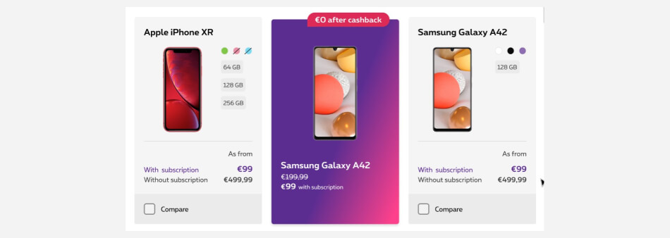
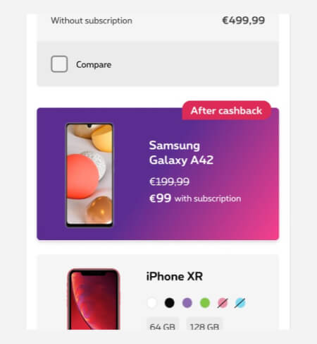
Banner boxes can be found on:
Residential device finder page
Small entreprise device finder page
Residential device finder page
Anatomy
Here is a quick overview of what a banner box contains to better understand this documentation:
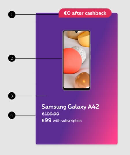
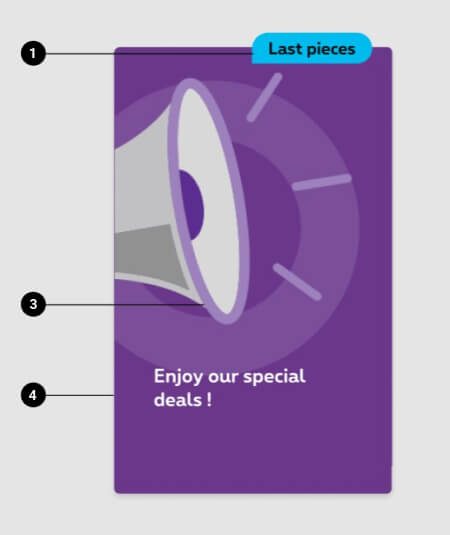
- Patch
Displayed in overlap on the banner, it can be red, blue or green depending of his content. - Device (default banner box only)
Can be a device alone or with an accessory. - Background
Either a gradient color align with the one in the Homepage (for default banner box) or a background visual (for background banner box). - Promo content
Name of the device, promo price, short condition.
Compositions
There are two ways to display a banner box. Either you have a banner box with content image (default version) or with a background image.
Default banner box
The visual is not in the background and is added just like any copy. It can be a device or an accessory. For this display, use the template devicename-yymm-bannerbox
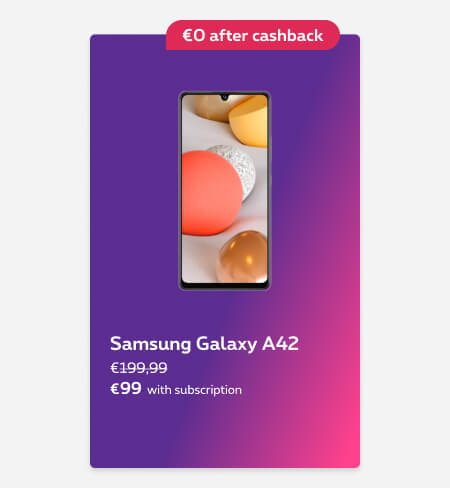
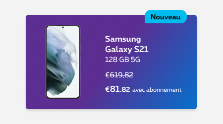
Background image banner box
The visual is in the background of the box. For this display, use the template name-yymm-bg-bannerbox
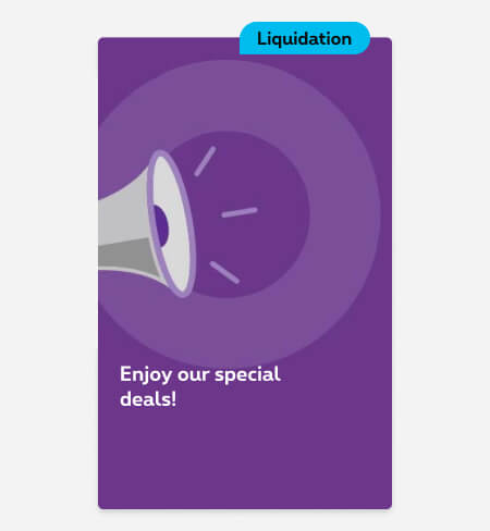

How to
Please use the template (cf usage > compositions) and respect the following guidances:
Default banner box
- Always center the device.
- The device should take the whole height of the template.
- Left/right distance depend of the device(s) width
- Test your visuals and adapt if needed
- Make sure your visuals are not too heavy and compress if needed.

Background banner box
- Make sure the main content isn’t placed behind the red text content area
- Make sure the area behind the text content is enough contrast for the readability
- Produce visuals for mobile and desktop (-s, -l)
- Test your visuals and adapt if needed
- Make sure your visuals are not too heavy and compress if needed.
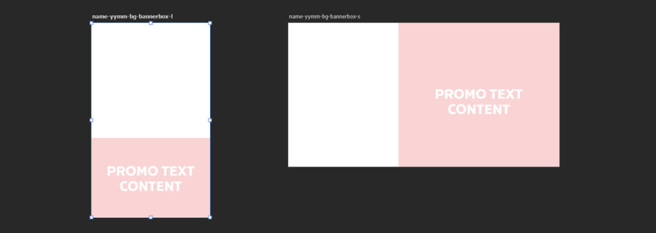
You're part of Proximus organization? Go to the template - If not, request it
Technical specifications
Please respect the following specifications when you export the images:
Default banner box
| Breakpoints | Size | Max weight | Format |
|---|---|---|---|
| 1 image for all breakpoints | 640x350px | 60KB | .png with transparent background |
Background banner box
| Breakpoints | Size | Max weight | Format |
|---|---|---|---|
| Mobile (-s) | 640x340px | 80KB | .jpg |
| Tablet and desktop (-l) | 280x460px | 100KB | .jpg |
To ensure good UI quality and website performances, it's very important to respect the maximum weight indicated while keeping a correct image quality. Discover here our images compression recommendations.
Naming convention
Please respect the following naming convention:
Default banner box

- Device name
- Date
yymm = year month (2108 = August 2021) - bannerbox
Background banner box

- Name
Description of the visual or campaign - Date
yymm = year month (2108 = August 2021) - BG
stands for background image - bannerbox
- Breakpoint mobile (-s) or desktop (-l)
- Language (optional) English by default (-en), French (-fr), Dutch (-nl). If it exists in only one language, it isn't mandatory to specify.
Images testing
Testing your image(s) is an important step of the images creation. It allows you to test the behavior in all breakpoint and to ensure the quality of the end results.
Discover here our images testing recommendations