Background outgrid
Extended background images or videos going out of the gridding
Overview
The background outgrid is a panel in the gridding that also extends out of the grid to the left or right. It can contain a visual or a video as a background.

Discover the outgrid component in the Design System
Anatomy
Here is a quick overview of what a background outgrid contains to better understand this documentation:

- Title
- Content (optional)
- Buttons You can use a primary, secondary and/or a tertiary button
Compositions
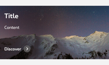
There are two ways to display a background outgrid. Either coming from the left or from the right.
Left background outgrid
The visual (or video) is the background. You can put the copy content in another gridding to give space for the visual in desktop. The content can be at the top or at the bottom of the box. For this display, use the template name-2010-og-left

Right background outgrid
The visual (or video) is the background. You can put the copy content in another gridding to give space for the visual in desktop. The content can be at the top or at the bottom of the box. For this display, use the template name-2010-og-right


Gridding
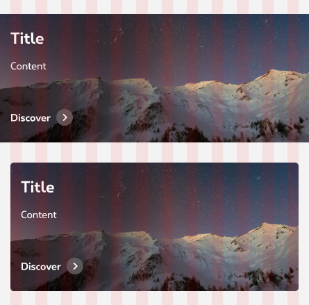
The composition options are based on our default grid. Please refer to the gridding article for more information.
The background outgrid is still set to our grid even though it spreads beyond it. You can put the background outgrid from a grid 4 to a grid 12.
In mobile you can only use one per row on a grid 12 or full width.

Accessibility
In this component, HTML elements are added on top of the image. This content is in positive or negative mode and this affects the creation of the image. Image colors should be carefully considered, with legibility and accessibility as paramount concerns.
Our websites and applications have to be accessible, meaning perceptible, operable, understandable and robust for users with disabilities. Discover here our accessibility guidance.
The visual presentation of text has a contrast ratio of at least 4.5:1. Success criterion 1.4.3 Contrast
Positive mode

Negative mode

Best practices
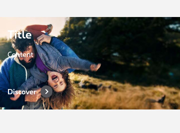
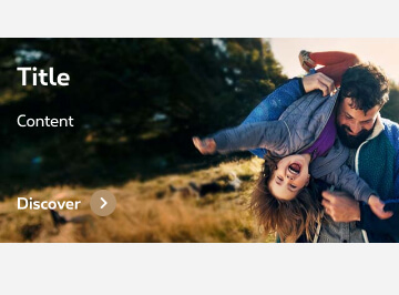
Make sure that the main content isn’t placed behind the title, copy or else (e.g.: main character, faces, devices, objects).
Don't
Do
How to
Please use the template and respect the following guidances:
- Choose the right template (cf usage > compositions)
- Choose the artboard according to the gridding of your outgrid (only for desktop since there's only one possible gridding for mobile).
- People's faces are not behind the text or cut out with different screen size.
- Test your visuals and adapt if needed. Visuals for this component are tricky to produce as safe areas are too random to define a definite safe area zone. So testing is really important with mutiple screen sizes.
- Make sure your visuals are not too heavy and compress if needed.

- name-2010-og-left
- name-2010-og-right
You're part of Proximus organization? Go to the template - If not, request it
Technical specifications
Sizes are for reference and guidance, note that they may change with the content or gridding. But in most case refer to the following specifications when you export the images:
Background outgrid
| Breakpoints | Size | Max weight | Format |
|---|---|---|---|
| Mobile (-s) | 640x? (height depends on content) | 80KB | .jpg |
| Tablet (-m) | Depending on the gridding and content | 10KB | .jpg |
| Desktop (-l) | Depending on the gridding and content | 150KB | .jpg |
To ensure good UI quality and website performances, it's very important to respect the maximum weight indicated while keeping a correct image quality. Discover here our images compression recommendations.
Naming convention
When exporting your visuals, make sure you use the correct naming. Do not use caps, spaces, accents or symbols (except a dash - ) Please respect the following naming convention:

- Name Description of the visual, campaign or page
- Date yymm = year month (2108 = August 2021)
- Component og (=outgrid)
- Position Left or right.
- Gridding gX (=number of grids)
- Breakpoint mobile (-s) tablet (-m) or desktop (-l)
Images testing
Testing your image(s) is an important step of the images creation. It allows you to test the behavior in all breakpoint and to ensure the quality of the end results.
Discover here our images testing recommendations